Dear ladies, have you ever found yourself wondering how to smoothly transition between your summer and autumn wardrobe? It’s a common problem we all face. Here’s a quick five-minute guide to how to change up your autumn wear and stay stylish throughout this season.
The rules for colour matching
Knowing how to match the colours is crucially important for the overall style.
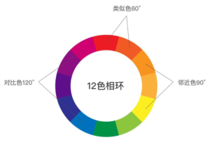
Principle 1
Contrast colour principle: choose colours with strong contrast, which will enhance the lively clean bright look. Eg. black&white, yellow&purple.
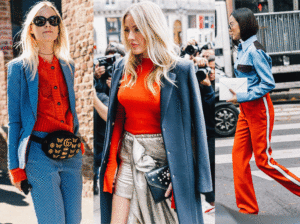
Strong contrast between blue and orange, very eyecatching
Principle 2
Similar colour principle: if you want to add an exquisite touch to your attire, match with similar colour or gradient colours. Eg. pure red & burgundy red, yellow & orange.
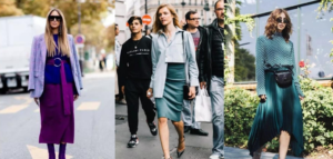
Similar colours create a harmonious look, suitable for both social & business occasions
Principle 3
Tricolor principle: less is more, please keep no more than 3 colours and with distinctive gradation for one match. The dominant colour counts around 60%, the complementary colour around 40% , while the third colour(ornament colour) is around 5%-15%.
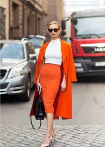
The dominant colour is orange, complementary colour is white, while her black bag and glasses is the third colour
Colours for autumn
Every season has its own characterized colours. For autumn, lots of people will choose the classic three: black, white and grey. Besides, camel and caramel are also popular, for they add a warm and dignified sense to the overall look.

Camel is classic colour for autumn, it is a colour makes people feel warm
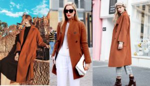
Caramel is a « heavy » colour, but could match with any colour you prefer
Matches with classic colours will never get you wrong, but if you want to be brilliant and different, try some of these trendy colours in 2018 to light you up! The top three in 2018 New York fashion-colours-for-autumn&winter released by Pantone Color Institute are: Red Pear, Valiant Poppy and Nebulas Blue. Other popular colours include: Martini Olive, Russet Orange, Ceylon Yellow, Quetzal Green, Mellow Rose, Almond Buff, Quiet Gray, etc.
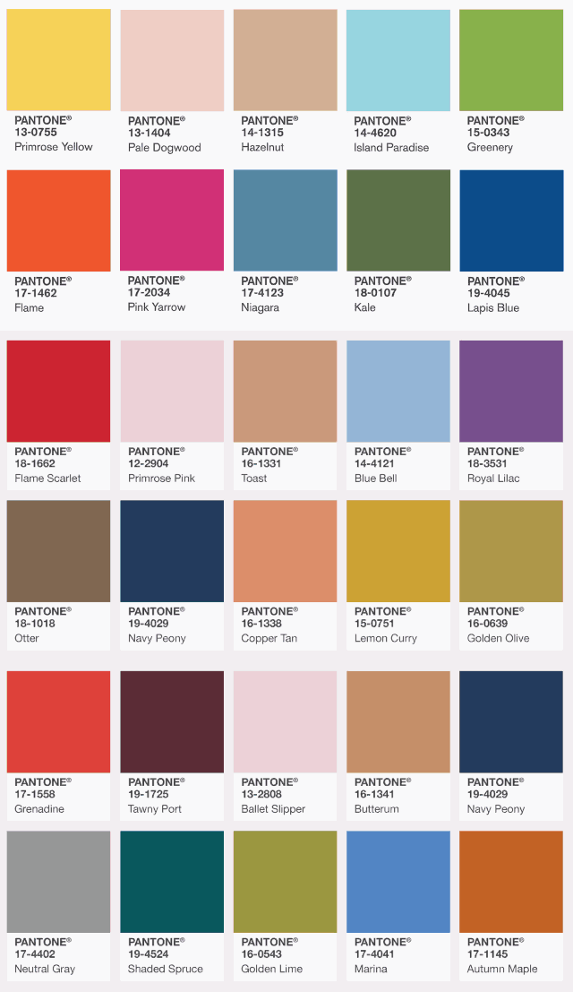
Autumn looks in 2018
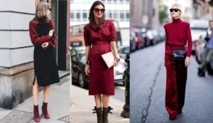
Red Pear
This colour is of a great sense of classical luxury, and will make your skin brighter. Perfect match with most of the colours like: orange, black, red, white and blue.
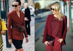
Valiant Poppy
Valiant Poppy is a bright colour that is very similar to pure red. It fits very well for people with darker/yellow skin. Match with the three basic colours(black, white, grey) to balance if you think this colour is too aggressive.
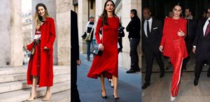

The grey coat balanced the red, make it a more professional look
Nebulas Blue
Nebulas Blue ranks the third among the most poplar colours 2018. It is a clear and pure colour with distinctiveness. You could match it with similar blue, or black, white, grey, and camel. Ladies with darker/yellow skin should be careful when wearing Nebulas Blue outfits. If you are not comfortable to use this colour as the dominant one, feel free to choose it as the ornament colour.

Quetzal Green
Quetzal Green combines the features from both blue and green. The most attractive match is paired it with yellow, and you could use white as the transition colour between the two. You could also match Quetzal Green with any shades of blue.

Dear ladies, which match do you like? Please just follow the colour protocol and choose those fit you! In the next articles, we will continue to introduce you different dresscode for autumn & winter, keep following and you will be surprised!
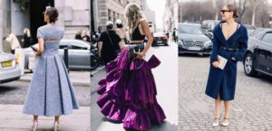
What do you think about these three colours, do you like it? Leave us a comment and we will introduce more~!


